Tuesday 19 March 2013

Advert Evaluation.

Evaluation
I think this final image was harder than my image for subcultures. 
Originally, I was going to submit this image 
I accidentally converted the image to greyscale using RAW resulting in the inability to add coloured text. 

I continued to fully edit but I wasn't pleased with the outcome. It didn't look as appealing. I figured that it was probably because of the border around the text, it's the focus of attention, and that is not what I intended. 

So I decided to start again, I changed the quote. I also removed the border around the text.
I realised once finishing that this image is a lot sharper, the model's face is sharper than my submitted final image.

Also, I'm really not a fan of the harsh shadows on her fore-arm.


Once I re-edited I realised that I hadn't credited the artist quote, so added it in again using the same font, however decreasing the opacity.

I think now the image is a lot softer, the HMV logo is the right colour and I have removed the border around the image, the final looks a lot cleaner.
If I were to re-do the shoot, I'd experiment with different lighting, maybe try some more 'beauty lighting'. 

Subcultures Evaluation.


Evaluation 

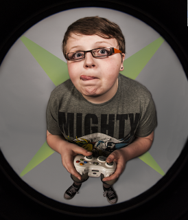
I think this image is quite fun and really captures the geeky/gamer look I was hoping for.
This image was relatively easy to produce, I already had my plan and idea's sorted and using my brother made the experience easier too. I found he was more confident and conveyed the emotion needed perfectly.
Whilst editing the image, I had originally decided without thinking to airbrush and remove blemishes off of his face however whilst boosting the clarity I decided against it. I figured that stereotypically, a gamer is conveyed as 'grubby', so by airbrushing away the dirt..I don't think the final image would have worked as well.
I added the green 'X' in the background to merely make the background more appealing.. but later realised it looked like the xbox logo. (below)

If I were to to do this image again, I'd probably spend more time on post production, edited some of the other images from my contact sheet. I'd also re-shoot, using the same lighting but making sure the backdrop isn't in the shot as this caused some problems for me.

Editing Subculture final


Original Image

First I worked in RAW. 
First I touched up any noticeable blemishes on RAW using the 'spot removal' tool. Here are two screen shots, before and after. 
The noticeable blemishes being small spots and marks on his glasses. 


I then changed the contrast to +30. 
I then opened the image up in photoshop as a 'smart object'. 
I then turned the clarity up to 50, I did this originally to begin the airbrushing process however I found that with the clarity up, it makes the image look better. 


Background.
During the shoot I noticed the backdrop wasn't big enough and I decided that post production could fix it.
I did this by using the brush tool and the clone tool.


I found this very difficult to achieve as the tools I were using weren't showing so I had to guess.
Unfortunately cleaning the edges proved difficult.


I then added the xbox logo to the background, using a new layer, the rubbing tool and turning the opacity down.
Once I was happy, I changed the opacity to 55%.


I then had to create my 'drawn', 'poster' effect, so the rough edges look like they are meant to be there. I also felt that this could give a 'comic/ graphic' feel to it.


First I selected 'Invert'. This was my result.


I then turned the 'Fill opacity' down to 10%.


Final image


Below are my final images for my self portrait/ subcultures idea.
I used my brother as he's generally perceived in a geeky, nerdy kind of way.


Here is my studio set up.
I shot on RAW and used a fish eye lens.
I used a mutual grey background with my model in the middle.
The first light was in front of the model up high, I used a honeycomb to create a softer ambient.
To the right I used a small soft box.


Exposures
ISO:  200
aperture:  F2.8
Shutter speed: 1/125


 Evaluation.
This shoot took around 2 hours, it was fun and my model was perfect. I had never worked with a fish eye lens before and I was unsure about the results, however I found it gave the image a funny feel.
The first four images were taken using only the honey comb light and I found they didn't hold the right mood.

I found this shoot quite difficult because I really wanted to pull off my model wearing glasses. It took a few attempts, if it wasn't the light reflecting, it was the camera.

Image 40 and 41 was successful and I have decided on using one of these in my final shoot.


Subcultures research

My idea for subcultures is 'gamer' 'geek' which is society is mainly centred around teenage boys who spend too much time in their room, playing game after game. 
I chose this because it reflects my lifestyle and personality. 

After researching over the internet there wasn't really anything that inspired me, then I went onto http://www.fotosearch.com 

Here are a selection of inspiring images I found using the terms 'geek', gamer', 'nerd' and 'xbox'


These images each inspired my idea for my final image and how I'm going to shot. 
I particularly like the fish eye lens images as by using this I can get a full body shot. Mainly, the use of body language is key. I want to create something fun, and real. As if the camera is the tv. 

Editing advertising final


Original image


First, I removed any blemishes using 'spot removal' on camera RAW.


I then boosted the clarity full and opened the image up into photoshop as a 'smart object'.
I continued to duplicate the layer and call the new one 'airbrush, rasterize the full clarity later and open the airbrush later back into RAW.


I then decreased the 'clarity' and opened the image back up into photoshop. I rasterized the layer, moved the full clarity layer above the airbrush later and used the rubbing tool to soften her skin.
I used the clone tool to remove any more blemishes and marks.


Once finished, I added the 'hmv' pink logo.
I then created a text layer and after researching, decided to simply use the photoshop text 'Ariel' in lower case.


I then added speech marks. The size: 72 and making then bold to increase the size.
I made two separate layers for each speech mark, making them easier to control.
I then added the quote 'Something's wrong when we regret' the same way' in a new text layer.
I also credited myself within the image as on the campaign posters, the photographer is credited.


I continued to select the original two layers, merging them together and making a new adjustment later. I decreased the saturation to make the image black and white but keeping the logo the trademark pink.


Finished


Final advertising shoot

Exposures:
ISO: 200
SS: 1/125
AP:2.8

Evaluation:
These are the images I took for my final advert shoot.
My previous shoot changed my mind on the backdrop colour, instead of the white, I decided to use black to work with negative space.

For this shoot I used just one light with a snoot on the right hand side, angling to my model.
I experimented with different distance. It was quite difficult because I wanted the emotion to be real. I asked my model to wear headphone and listen to her favourite song. She instantly began smiling, singing, dancing and there was a lot of movement.  Below is a lighting diagram.